Charts and Displays
Book Report provides several ways to visualize and browse your data. This page goes over all of them, other than the Details Table which is explained on the next page.
We recommend having Book Report open while you read this page, so that you can see the charts with your real data.
These charts can be customized to show the data you're most interested in. For example, you can change the chart to display earnings, giveaways, borrows, page reads, or many others. You can also change what the chart to be divided up by - including by book, author, series, or transaction type.
Charts
Pie Chart
The pie chart is a simple display to see how much of the total is made up by each attribute.
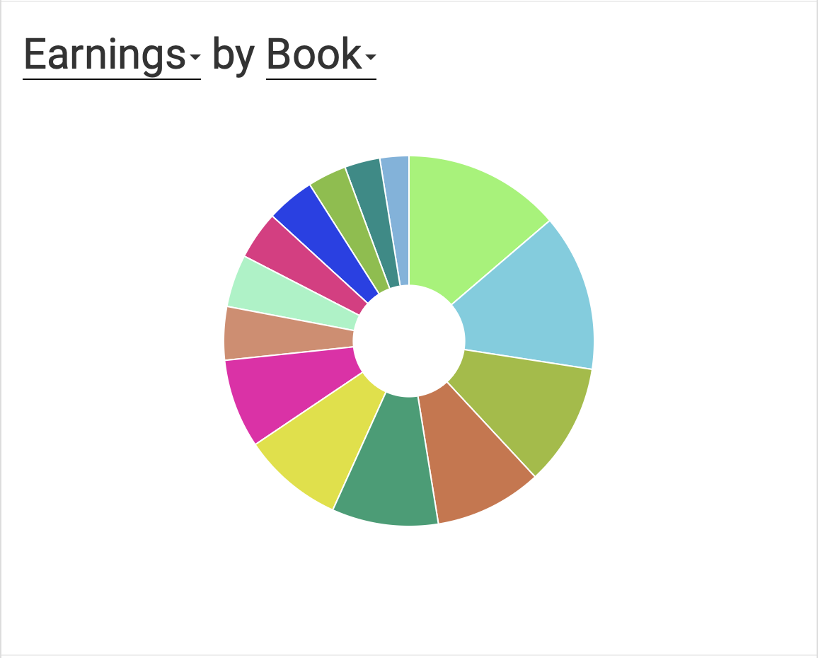
You can customize both the metric and the attribute that the pie chart displays. The metric determines the size of each slice, and the attribute determines the color.
Date Chart (Area)
The date chart is a good way to see how your sales have changed over time. It shows the total of the metric you choose, broken down by the attribute you choose.
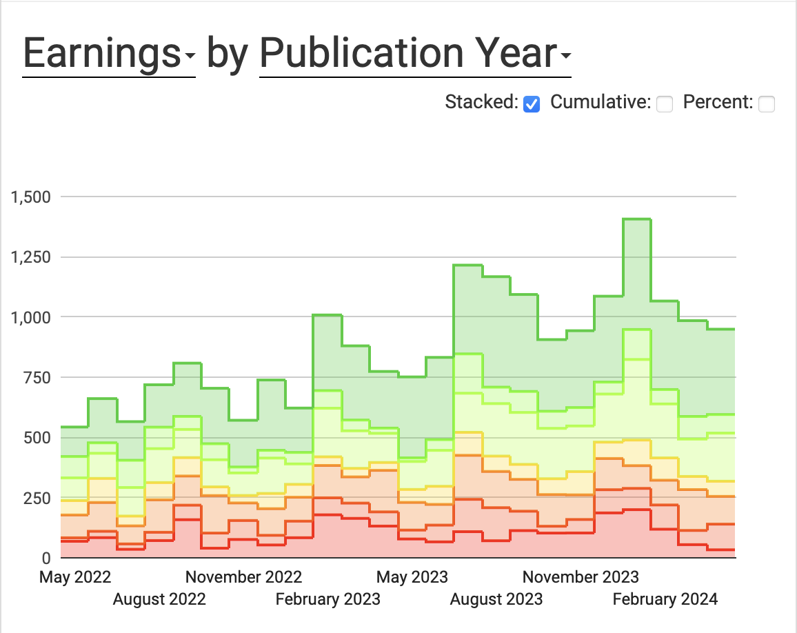
You can customize both the metric and the attribute that the area chart displays. The metric determines the height of each point, and the attribute determines the color.
We've used Publication Year for these examples, but you can choose any attribute you like. Book, transaction type, series, and author are other common choices!
There are three additional options, each with a checkbox:
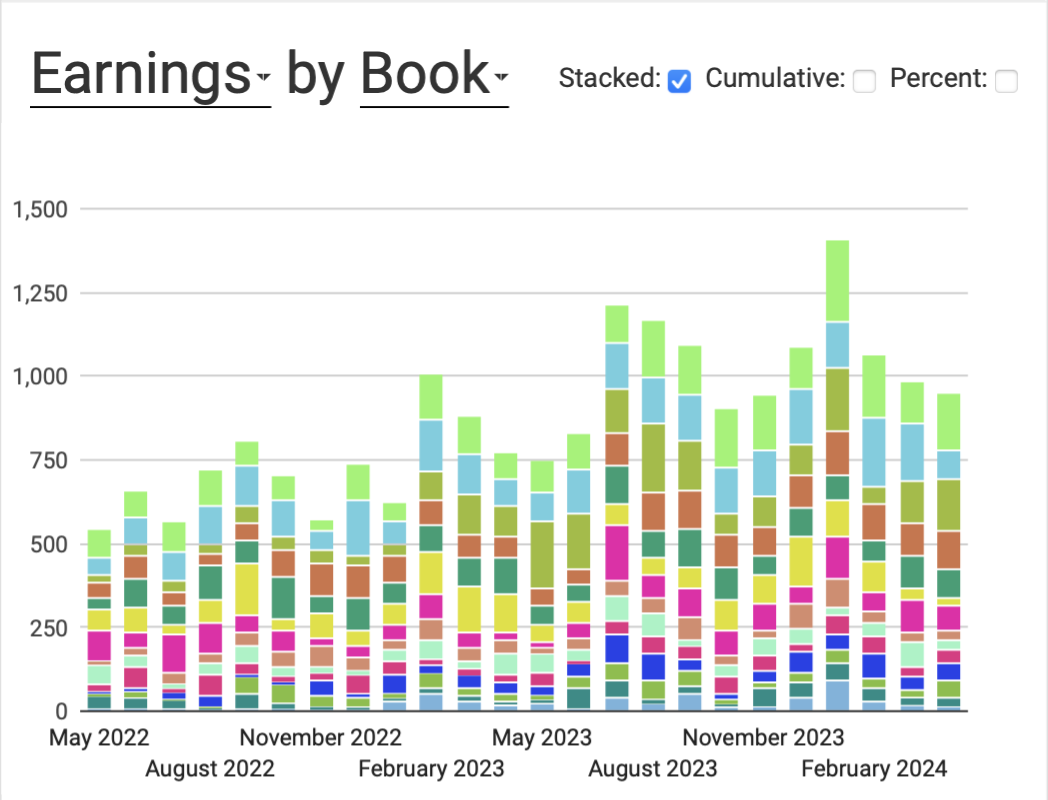
- Stacked: When checked, the values for each date are stacked on top of each other so the resulting height is the total for the date. When unchecked, the height for each attribute is shown individually.
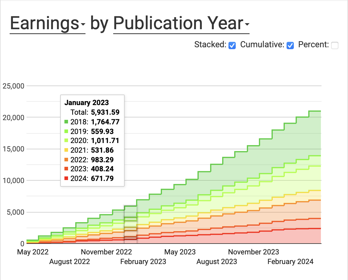
- Cumulative: If checked, the date chart will show the total of each attribute up to that point in time, rather than the total of each attribute at that point in time.
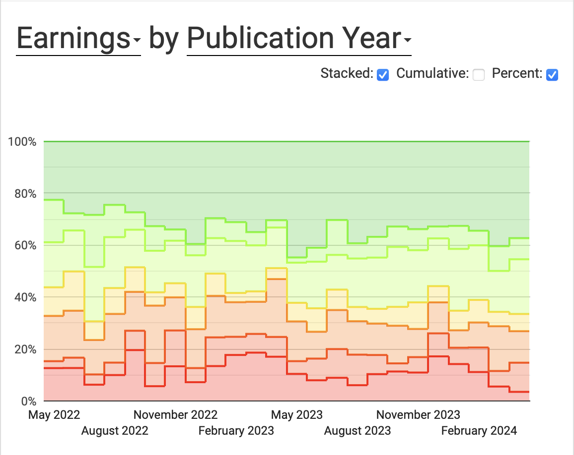
- Percent: If checked, the date chart will show each attribute as a fraction of the total, rather than the absolute value.
Map Chart
The map chart shows a map of the world and highlights the countries where you've earned royalties.
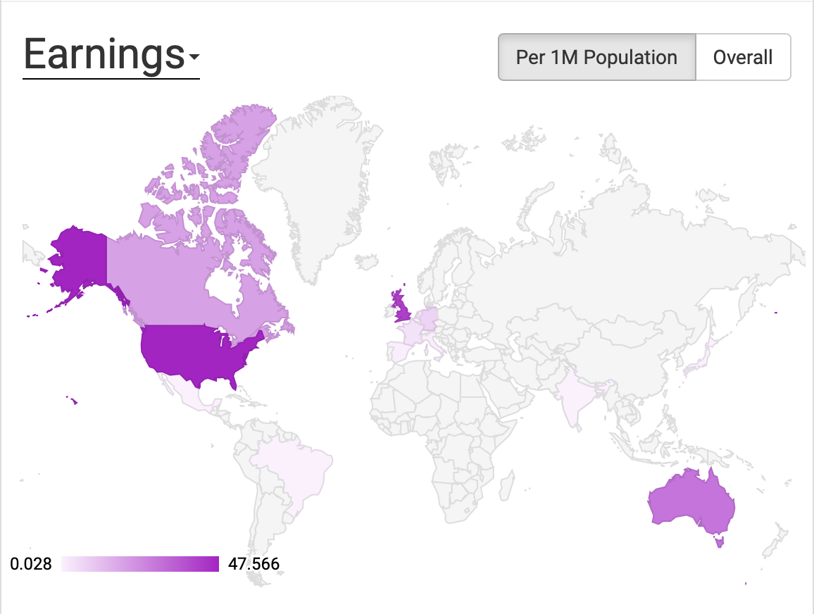
You can click "Earnings" to change it to any other metric you'd like to see on the map.
There is also a toggle, where you can select either:
- Overall: This shows the total earnings for each country.
- Per 1M Population: This shows the earnings per 1 million people in each country.
Viewing your earnings per 1M population can be a good way to see what markets are most lucrative relative to their size. This can be a good sign that advertising in those countries could be profitable.
Date Chart (Column)
The column date chart works just like the area chart, but with columns instead of areas. Some folks prefer the asthetics of columns, particularly when there are many values for the attributes.
Date Average Chart
This chart shows you the average value for your chosen metric for either each day of the week or each month of the year.
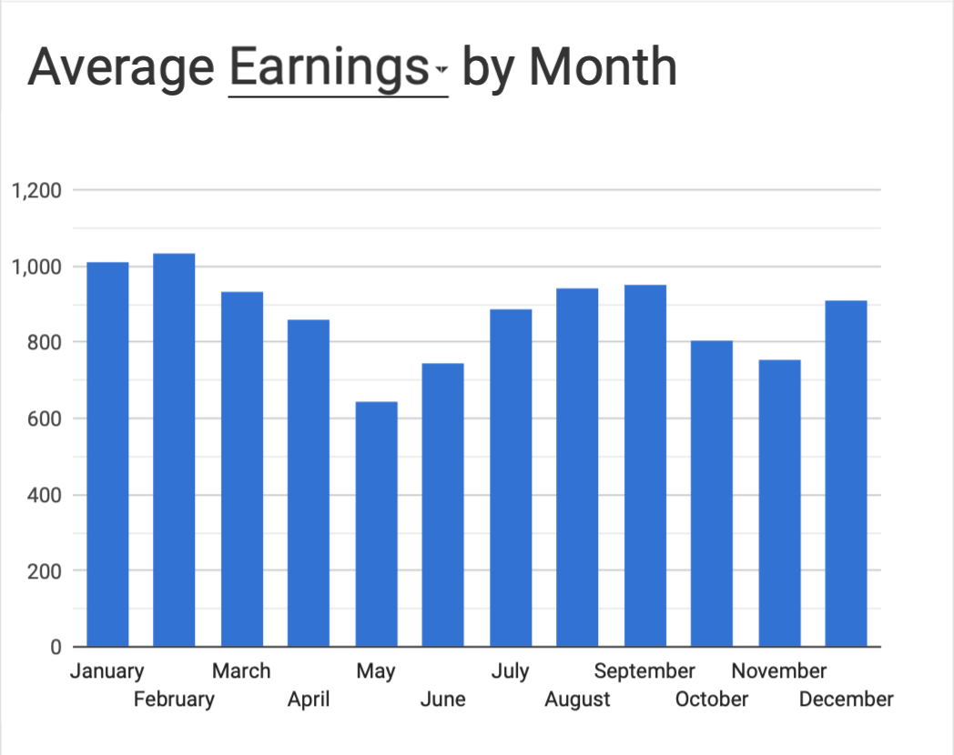
It finds the average per week day if the duration of the report is less than 24 months long.
Other Displays
Total
The total display shows the total earnings during the period selected. It's also shows how many different books contributed to that total.

Covers
This component shows the covers of your top six books, based on whichever metric you'd like.

If you've got covers you'd rather people not see over your shoulder, you can remove this component from the report.
Numeric
The numeric display shows a metric you've chosen, split by the attribute you've chosen, showing the top five and the "Other" category.
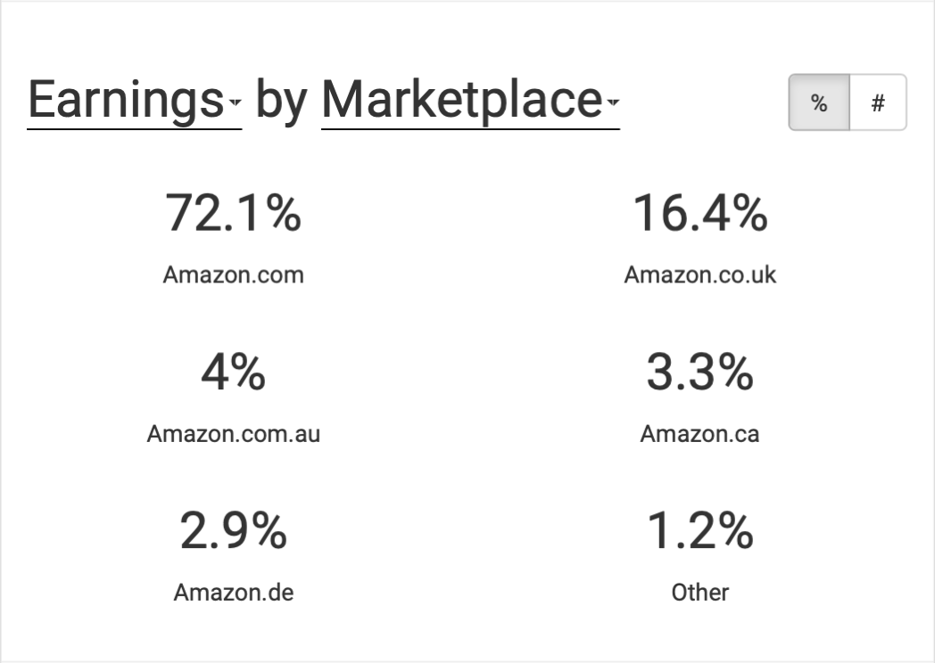
You can toggle to show either percentages or raw numbers.